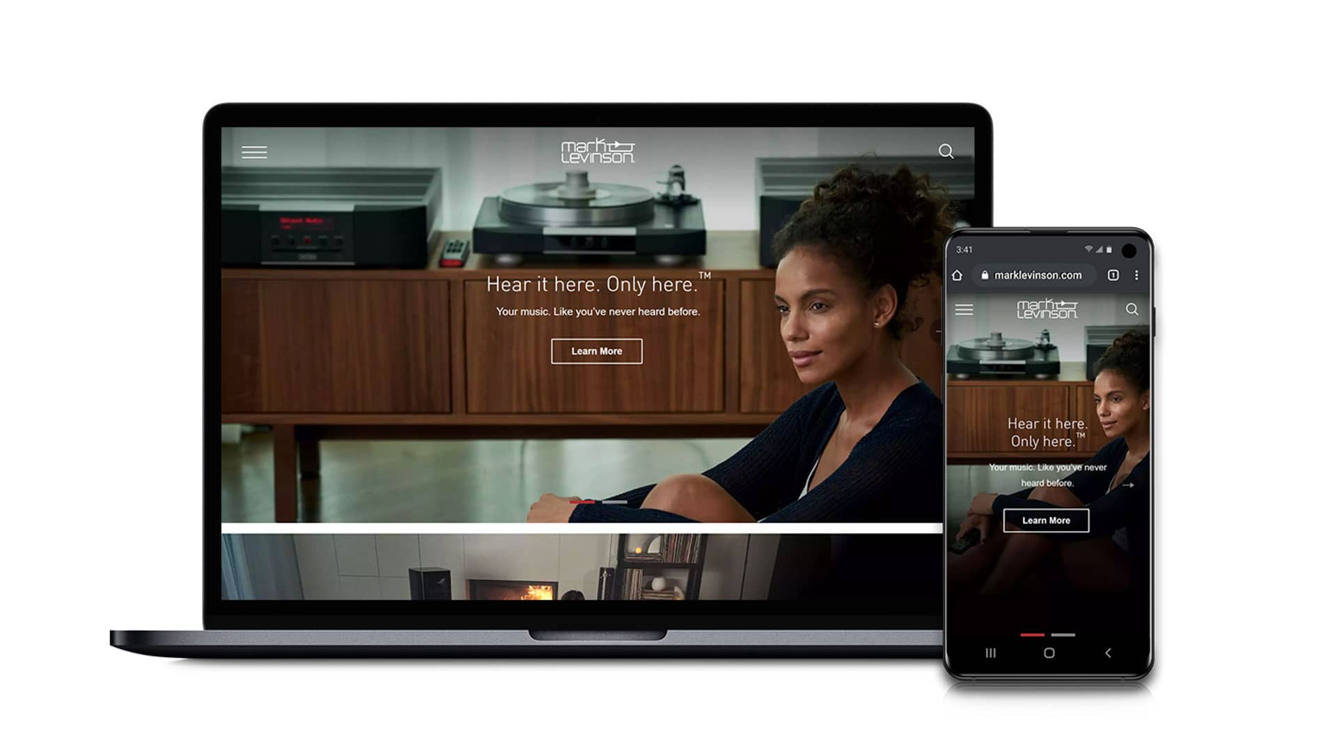
Mark Levinson Brand Refresh & Digital Experience
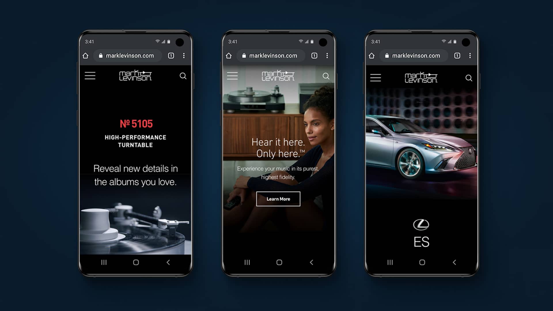
Alongside Mark Levinson, we developed a modern website filled with fresh content that would resonate with their new target audience: affluent millennials. The new MarkLevinson.com experience is one where storytelling, discovery and a deep appreciation for music converge. The result? A website that no longer appeals just to audiophiles, but to music-lovers everywhere.

The existing Mark Levinson website was built for audiophiles. In order to deliver an online experience that resonated with millennials, Mark Levinson tasked us with creating content from scratch that embodied the new look and feel of the brand.
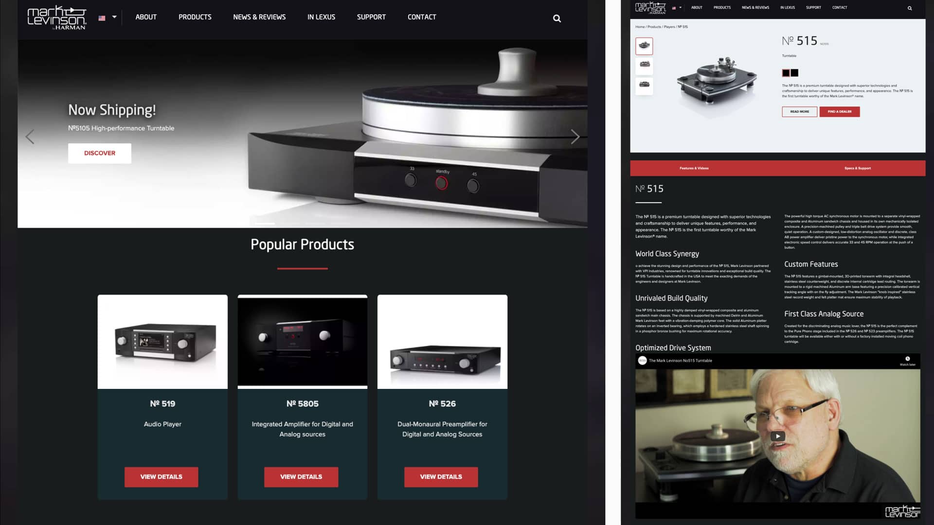
We interviewed multiple stakeholders to identify what was—and wasn’t—working on the legacy site. Then, we conducted an analysis of competitor sites and best-in-class luxury sites outside of the music category. Our takeaways? Although Mark Levinson is luxury, the brand shouldn’t come across as cold or aloof. Instead, the new brand and website needed to feel approachable, passionate and aspirational.
Our research also determined that the new audience values fulfilling experiences above anything else. Because of this, navigating the website should feel like a journey of discovery. And the content should not only convey the elegance of the products, but also paint a picture of how Mark Levinson can enhance everyday experiences.
Through a remote usability test, Huemen learned that readability and lifestyle content would be paramount in the new website. To keep users engaged, we would also need to include subtle animations or videos.
Make it worth their time: While the new target is eager to learn new things online, they carefully curate each moment of their day. So the new website needed to make them feel like they were on a journey of discovery as they scrolled through the products, rather than sitting through a typical product pitch.
Think beyond the website: Mark Levinson products can run more than $10,000 each. For people new to luxury audio, this raises the likelihood of facing sticker shock once they decide to visit a retailer. To mitigate this, the revised digital experience needed to leave no doubt in the visitor’s mind that Mark Levinson products exude luxury and are therefore worth their premium price tags.
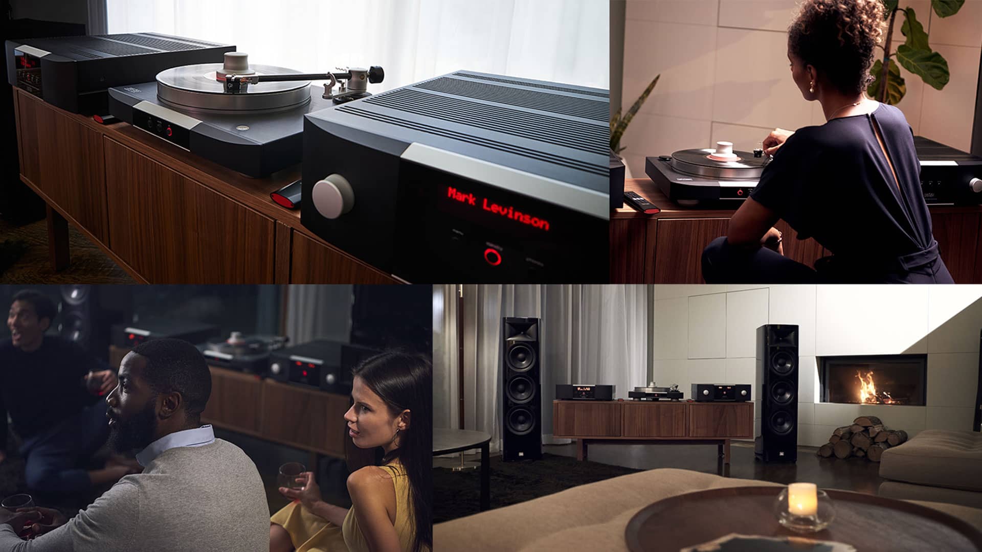
Content Development Because the new audience is focused on having rich, fulfilling experiences, we developed content that showcased how Mark Levinson can create breath-taking moments through pure audio. We accomplished this by creating a gallery of aspirational lifestyle images and video vignettes. Each not only showcased the incredible craftsmanship of the products, but also how Mark Levinson can elevate your life in every single way.
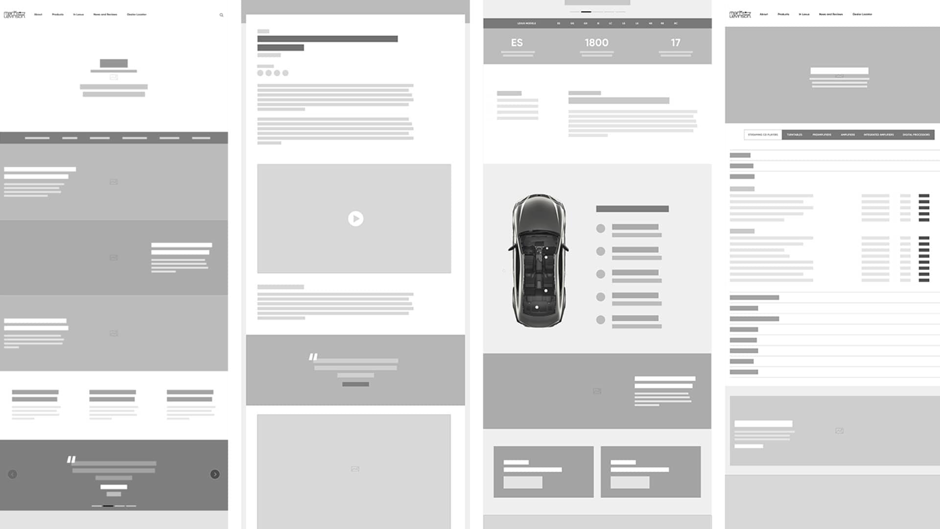
UX Design The new website needed to embody a feeling of luxury while still remaining easy to use and understand. We struck that balance by using rich, immersive imagery and formatting the site structure to feel effortless when navigating through the different pages. Since understanding the experience of Mark Levinson requires listening to music in person, our ultimate goal was to direct users to find a dealer near them. We did so by placing multiple touchpoints across the site that nudged users toward the dealer locator.
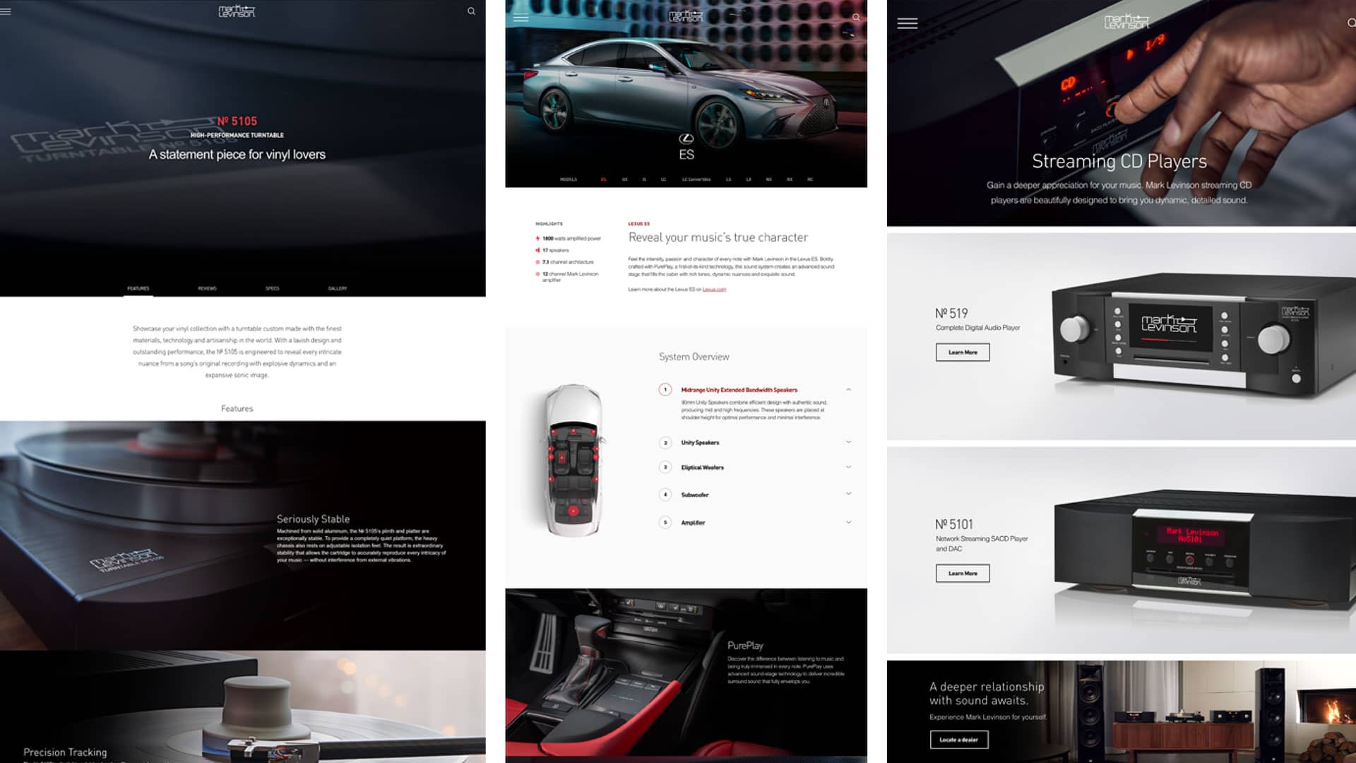
The new MarkLevinson.com provides a seamless and luxurious online experience, showcasing the brand’s rich history and sharing its passion for music. The launch, accompanied by a powerful social media campaign, generated a 74% increase in traffic and a click through rate increase of 31% for the dealer locator.
Let's get started: Talk to Huemen
© Harman International.